QC Tools
Indispensable Tools for Business Process Improvement and Problem Solving
Business Drivers for Process Improvement

01.
COST
Overall Cost of Ownership for the Customer determines Satisfaction and Repeat business. Cost arising out of the Process need to be kept low to ensure profitability and increased market share.

02.
TIME
Response to Customer, Time to Market, Productivity are Critical to a Business Success. Measure of Time for every activity plays a vital role in adaptability to market changes, reduced cost and improved profit.
03.
QUALITY
Quality drives Business – Quality as perceived/ expected by Customer. In other words, Quality AFTER the product reaches the Customer. Quality Assurance & Quality Control are essential for customer retention.
Why Live!QC Tools is Essential?
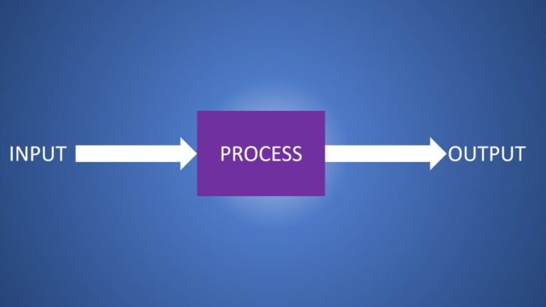
Every Process has Input and Output. If a desired Output is necessary, then the Input and Process have to undergo changes. If the Input and the Process do not change, how can the output change? In order to have desirable characteristics in the Output, the Input and Process need to be calibrated for optimal performance and monitored. By studying the variables in the process as well as the Input, and their sensitivities to changes in the Output, optimality can be arrived at by continuously observing process data, analyzing causes-and-effects and looking for inter-relationships between variables that could emerge as factors. 7 QC Tools are handy in achieving this for any Process that needs to be followed by Organizational Team members.
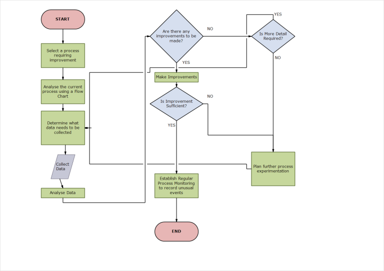
The benefits of developing a flow chart are:
- Simplification
- Rearrangement
- Combination
- Elimination
of activities, upon analyses, to make the process resilient, purposeful, deliverable, participative and easy to accomplish the goals of the Process.
To improve a Process, it is important to define a process in terms of activities, conditionalities, milestones. This is accomplished by developing a process flow chart that defines supplier/customer (Internal or external) relationships, standardizing procedures, identifying process complexity and opportunities for improvement. Whether it is designing a new process or improving an existing process, a detailed flow chart is a must. Making it visible to stake holders and incorporating feedback from those who participate in the process or are influenced by it, flow chart helps improve productivity and eliminate issues arising out of assumptions. Flow chart transforms organization from being person centric (in decision making) to process-centric.
- Purpose
- Place
- Sequence
- Persons
- Method
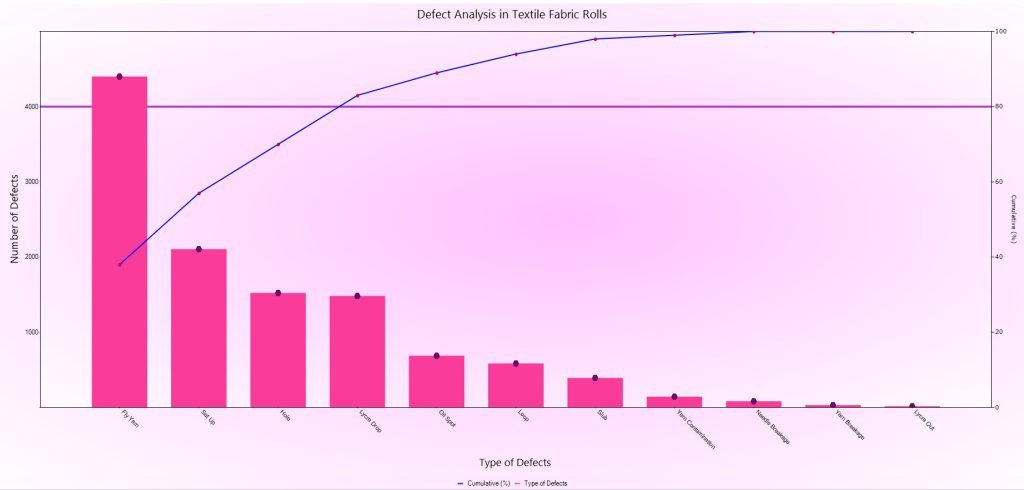
Pareto Charts help identify the 20% of causes that influence 80% of the effects, in general terms. This helps quantify the highest ranking few causes while displaying the triviality of the lower ranking ones. It helps arrive at areas that can have maximum effect with focused efforts. While this empirical rule has no mathematical foundation, it is proven to deliver results when used with prudence and past knowledge of similar causes-and-effects.
Advantages of using Pareto Charts are:
- Quantifies the Impact of a few significant influencing factors
- Helps pay attention to fewer variables to achieve desired outcome
- Quickens the pace to identify and eliminate an contributor to an issue that affects the desired outcome
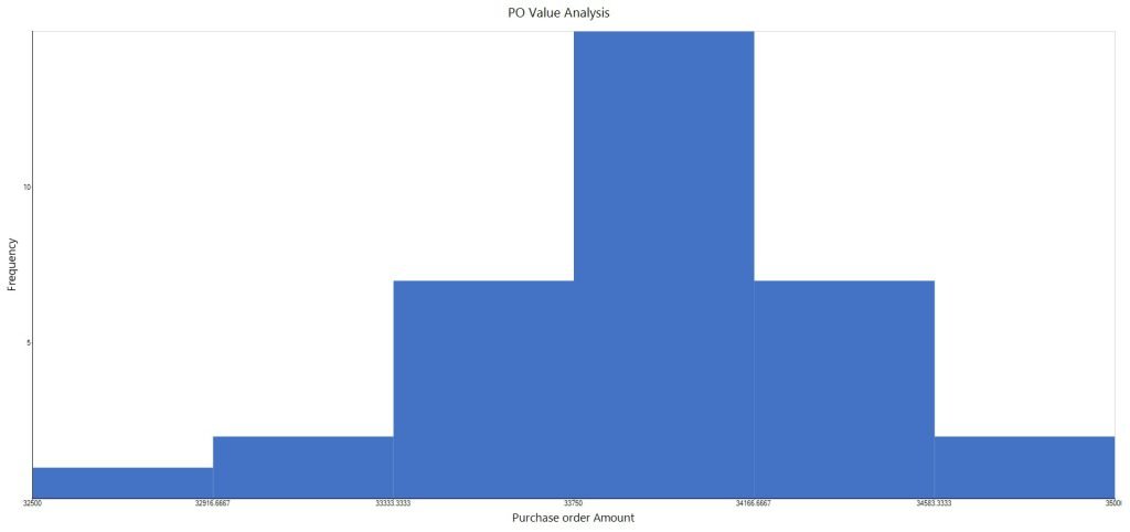
Data recorded as numbers are difficult to interpret unless it is seen as a graphical plot. Such data, not analyzed or put to use, lies dormant without any benefit for the organization. ‘A Picture is worth a thousand words’ gains a follower with Histograms. If the data is sorted into bins having ranges, the frequency distribution gives a visual picture of the spread across the range of data plotted.
This frequency distribution plot enables data to be grouped about a central value and the peak(s) occurring about the mostly frequently occuring result. This gives a heads up on the process capability and the spread. Multi-modal charts indicate problems with the process and hence the necessary to find corrective actions.
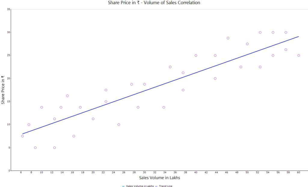
In order to ascertain if there is an association or correlation between two parameters, Scatter Diagram is used. Data is plotted and seen if it lies about a central line or curve, depending on the interpolation model adopted.
This chart helps establish dependence between two variables in terms of inter-relationship, if it indeed exists. This could also be used, to assess inter-dependence, if any, between two processes to see if there is an influence of one on the other
When used in conjuction with cause-and-effect analysis, this tool could be used quickly arrive at causes to mitigate the risks involved with an effect.
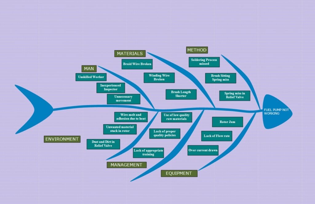
Cause and Effect Analysis is a simple technique used to elicit possible contributory factors, or causes, for an effect. The method employs the use of expert knowledge of team members, drawn upon from varied streams across the organization and outside, for constructing a cause-and-effect diagram. This diagram is also called as Ishikawa Diagram or Fishbone Diagram.
The Effect is shown at the head of the central spine with the causes on the ribs that branch from it. This serves as a knowledge-building exercise within the organization that helps capture all aspects of an effect with significant and trivial causes assigned and classified. The classification could be Man, Machine, Method, Material, Environement to name a few.
Cause and Effect Diagram forms the central part of any Quality control Activity.
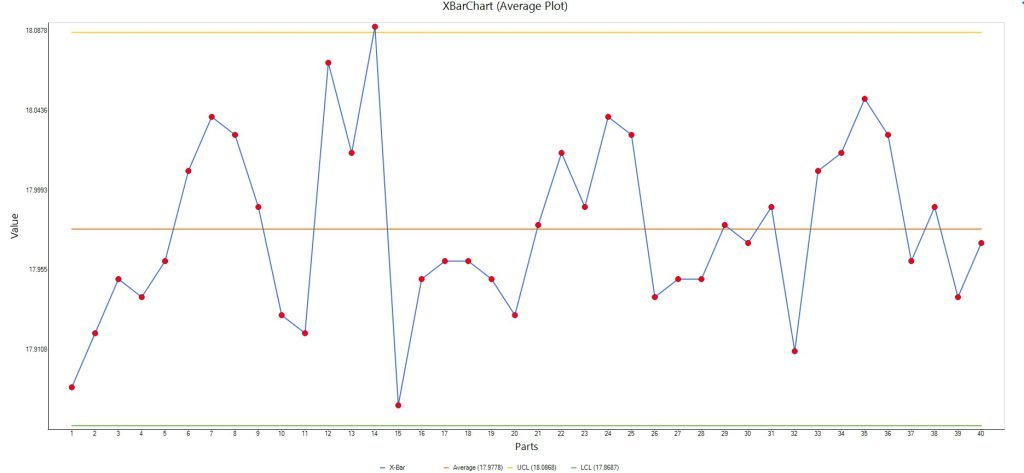
In order to control a process using Variable Data, it is important to monitor the current state of accuracy (central tendency) and precision (spread) of the data distribution. Control charts are used to achieve this. It is important to obtain evidence from process samples taken at random intervals.
Control Charts help to determine actions as follows:
- The process should be allowed to run without adjustment when random or common causes of variation are present
- An early warning is sounded when deviation is possible
- Process correction is inevitable when assignable or special causes of variation are present. The process has wandered, necessitating corrective action to prevent defective output
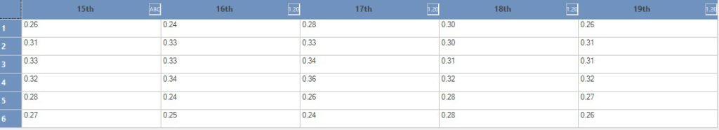
Charts, interpretations and actions initiated depend on Data that is collected. Such data should be collected in such a way that it is reliable, timely, sufficient, traceable and actionable. Check sheets are a great vehicle to gather data in re-usable form.
Check sheets provide for assimilation of data from various sources, at the time of data generation and help obtain correct picture on sampling, person, machine that provides the data. Irrespective of whether the monitored or measured data is within or outside desired limits, the data need to be recorded for analysing and getting a correct picture. Check sheets serve as the primary source of data available to stake holders to assess and provide for remedial measures, if and when required.

Data Driven Enterprises
Successful Organizations stand apart from the crowd, having institutionalized processes and mechanisms for continuous improvement. Importance of Live!QC Tools can be seen from answering the following questions:
- What is done ? (Process Flow Chart)
- How often is this done? (Check Sheets)
- How does the data look like ? (Histograms)
- How are the trends? ( Control Charts)
- Which are the significant issues? (Pareto Chart)
- What causes the Problems ? (Fishbone/Ishikawa Diagram)
- What are the relationship between factors ? (Scatter Diagram)
Continuous Process Improvement
Enabling Process visibility to stakeholders, measuring factors influencing/ affecting the process, controlling the parameters for a deterministic output are vital for the Organizational Efficiency and Productivity.
- Live!QC Tools, when deployed effectively, enable processes to deliver
- ISO 9000 emphasizes Continuous Process Improvement that is possible using the Basic 7 QC Tools
PRODUCT MATRIX
|
Feature
|
Essentials
|
Prime
|
Expert
|
Expert Plus
|
|---|---|---|---|---|
|
Essential Quality Control Tools Including Pareto Chart, Control Chart, Histogram, Scatter Diagram
|
|
|
|
|
|
Data Sheets
|
|
|
|
|
|
Fishbone Diagram/Root Cause Analysis
|
|
|
|
|
|
Process/Flowchart
|
|
|
|
|
|
Live!Records
|
|
|
|
|
|
Live!Charts
Including Bar Charts, Line Charts, Pie Charts, Box and Whisker Plot, Area Charts, Funnel Chart, Pyramid Chart, Stacked Charts, Polar Chart, Radar Chart |
|
|
|
|
|
Version Tracking
|
|
|
|
|
|
User Preferences
|
|
|
|
|
|
Live!Search
|
|
|
|
|
|
History Traceability
|
|
|
|
|
|
Export Options for Charts and Diagrams
|
|
|
|
|
|
Classification and Grouping
|
|
|
|
|
|
Public and Private Rights Management
|
|
|
|
|
|
Observations/Feedback
|
|
|
|
|
|
Live!Task
|
|
|
|
|
|
Live!Action
|
|
|
|
|
|
Live!Dashboard
|
|
|
|
|
|
Live!Issue
|
|
|
|
|
|
Live!NC
|
|
|
|
|
|
Live!CR
|
|
|
|
|
|
Live!Assets
|
|
|
|
|
|
Notification
|
|
|
|
|
|
Trigger Event for Notification
|
|
|
|
|
|
Live!Skills
|
|
|
|
|
|
Live!Parts
|
|
|
|
|
|
Live!CAPA
|
|
|
|
|
|
Template – Pre-configured Ready-to-use
|
|
|
|
|
|
User Defined Templates
|
|
|
|
|
|
Gantt Chart for Planning
|
|
|
|
|
|
Maps to plot geographical data
|
|
|
|
|
|
Data Collector – Collect data from Text, CSV and Spreadsheet
|
|
|
|
|
|
Live!Reports
|
|
|
|
|
|
Live!FMEA
|
|
|
|
|
|
Live!CP
|
|
|
|
|
|
Data Collector – Collect data from RDBMS including PostgreSQL and MS SQL
|
|
|
|
|
|
User-defined Query & Named Query
|
|
|
|
|
|
Live!8D
|
Add-On
|
Add-On
|
|
|
|
Live!8D – User defined Templates
|
Add-On
|
Add-On
|
|
|
|
Live!8D - Reports
|
Add-On
|
Add-On
|
|
|
|
Live!PPAP
|
Add-On
|
Add-On
|
Add-On
|
|
|
Live!MSA
|
Add-On
|
Add-On
|
Add-On
|
|
|
Live!Inspect
|
Add-On
|
Add-On
|
Add-On
|
|
|
Live!Audit
|
Add-On
|
Add-On
|
Add-On
|
|
|
Live!Web DC **
|
Add-On
|
Add-On
|
Add-On
|
Add-On
|
- - View only (Creation, Modification, attach references are not allowed)
- ** - Requires Network License.
Digital Transformation is the
key to Success
GET IN TOUCH
Contact us & Reach !!
Location Address
- Live!QC Tools – QMS Software in Chennai, 32/16, Design Towers, 5th St, Dr.Subbaraya Nagar, Kodambakkam, Chennai, Tamil Nadu 600024
Phone Number
- Mob : (+91) 89258 66589
Email Address
- info@liveqctools.com