Introduction
A Pareto chart combines a bar chart with a line chart to visually represent the Pareto Principle (80/20 rule). It shows the individual value for each item in descending order as a bar and a cumulative total as an ascending line.
History of the Pareto Principle
Vilfredo Federico Damaso Pareto gave the world the concept of this principle. He made a famous observation that 20 percent of the population of Italy owned 80 percent of the property.
In 1941, Joseph M. Juran generalized the rule from Pareto to the 80/20 rule and began to apply it to quality issues. The rule, often referred to as “the vital few and the useful many,” states that roughly 80 percent of the effects come from 20 percent of the causes.
Why Use a Pareto Diagram in Manufacturing?
In a fast-paced manufacturing environment, time is limited and operational complexity is high. Using Pareto charts, continuous improvement teams can make decisions based on what will deliver the greatest return.
This is especially important when improvement efforts involve cross-functional teams. Visualizing data in a Pareto chart gives everyone the same reference point. It aligns operations, quality, and maintenance teams around a shared understanding of the problem and its impact.
Steps Involved in Pareto Analysis
Follow these structured steps to perform effective Pareto Analysis:
1. Identify the Problem and Define Data Scope
2. Collect and Categorize Data
3. Sort Data in Descending Order
4. Calculate Percentage and Cumulative Percentage
5. Construct the Graph
6. Plot Bars and Cumulative Line
7. Analyze the Chart
Advantages of Pareto Analysis
1. Data-Driven Decision Making
Eliminates assumptions and enables objective prioritization.
2. Improved Communication
Provides clear visual representation for management and shop floor teams.
3. Prioritization of Critical Issues
Focuses resources on high-impact problem areas.
4. Visualization of Cumulative Impact
Shows how a small number of causes contribute to a large percentage of the issue.
Live!QC Tools – A Game Changer for Pareto Analysis
Here comes the game changer Live!QC Tools , In Live!QC Tools you just need to collect the data and define X-axis and Y-axis and you will get the chart with percentage and cumulative count.
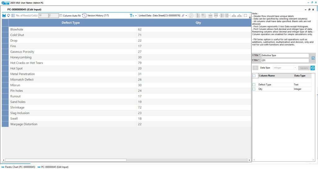
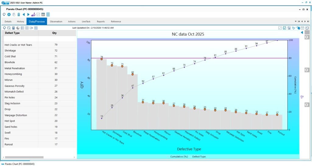
In Live!QC Tools data will be linked with charts, So once data get updated instantaneously reflects in chart ,i.e: Dynamic Update of data.
Thus you can build your analytical charts with appealing aesthetics and lead your organization Data – Driven and Process centric with the help of Live!QC Tools.
Conclusion
The Pareto Chart remains one of the most powerful tools in quality management. By focusing on the vital few causes that generate the majority of problems, organizations can achieve faster improvements with fewer resources.
When combined with digital tools like Live!QC Tools, Pareto Analysis becomes faster, smarter, and more impactful — transforming reactive problem-solving into proactive quality management.